Problem
Research around the IBM Cloud catalog indicated that users were confused by the layout and couldn't find all the features when browsing the products. The users were much more likely to leave without exploring further.
Solution
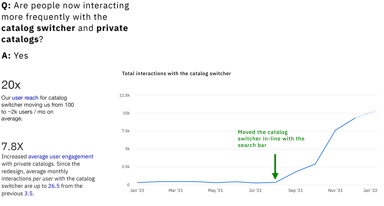
Redesign the IBM Cloud catalog to make it faster, more enjoyable, and easier to navigate. The new design leveraged user feedback to identify and prioritize the features that would make their experience more efficient and more in line with users' needs.
Design roles
- Product Design
- Visual Design
Design deliverables
- Personas
- Wireframes
- Prototype
- Visual Design
Tools & Software
- Sketch
- Invision
- Free Hand
01
Research & Discovery
Understanding the landscape
Before jumping into design explorations, I needed to understand users' pain points and how the IBM Cloud catalog stands by competitors. After extracting findings from research, the results revealed gaps in industry-standard features and naming systems.
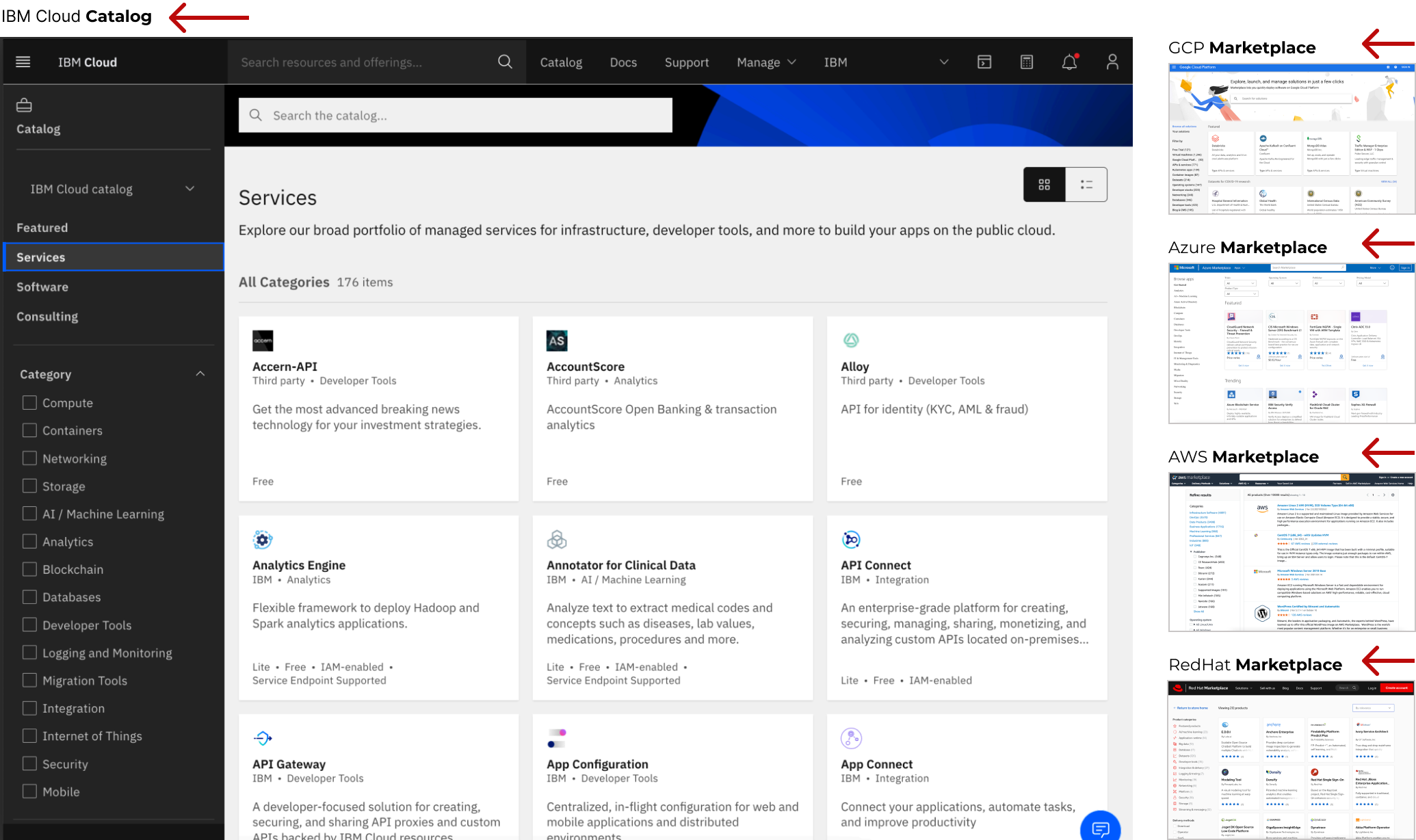

- 1. Users were not discovering private catalogs because they were overlooking the catalog switcher.
- 2. Users weren’t noticing that they were only seeing a subset of products by default.
- 3. This scrollbar was not visible unless users were already scrolling in the section - which made it easy for users to overlook available filters.
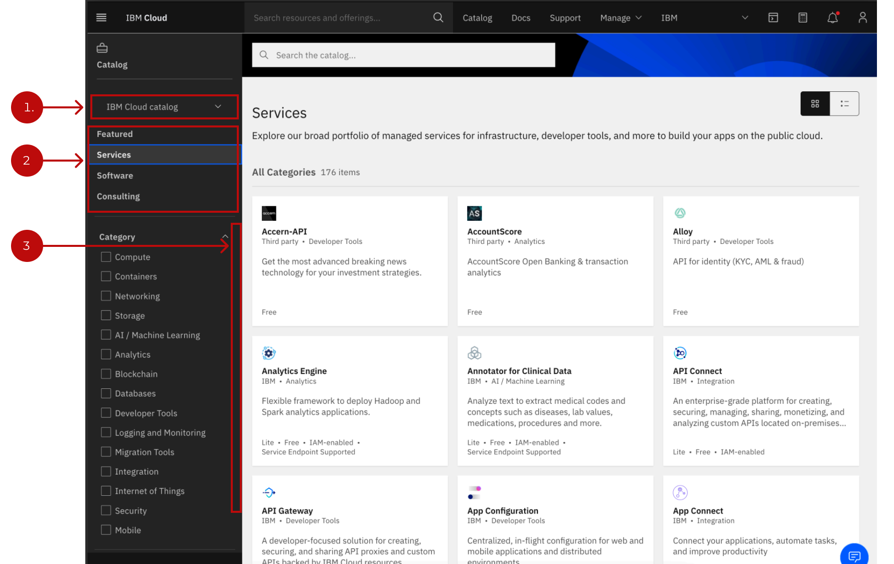

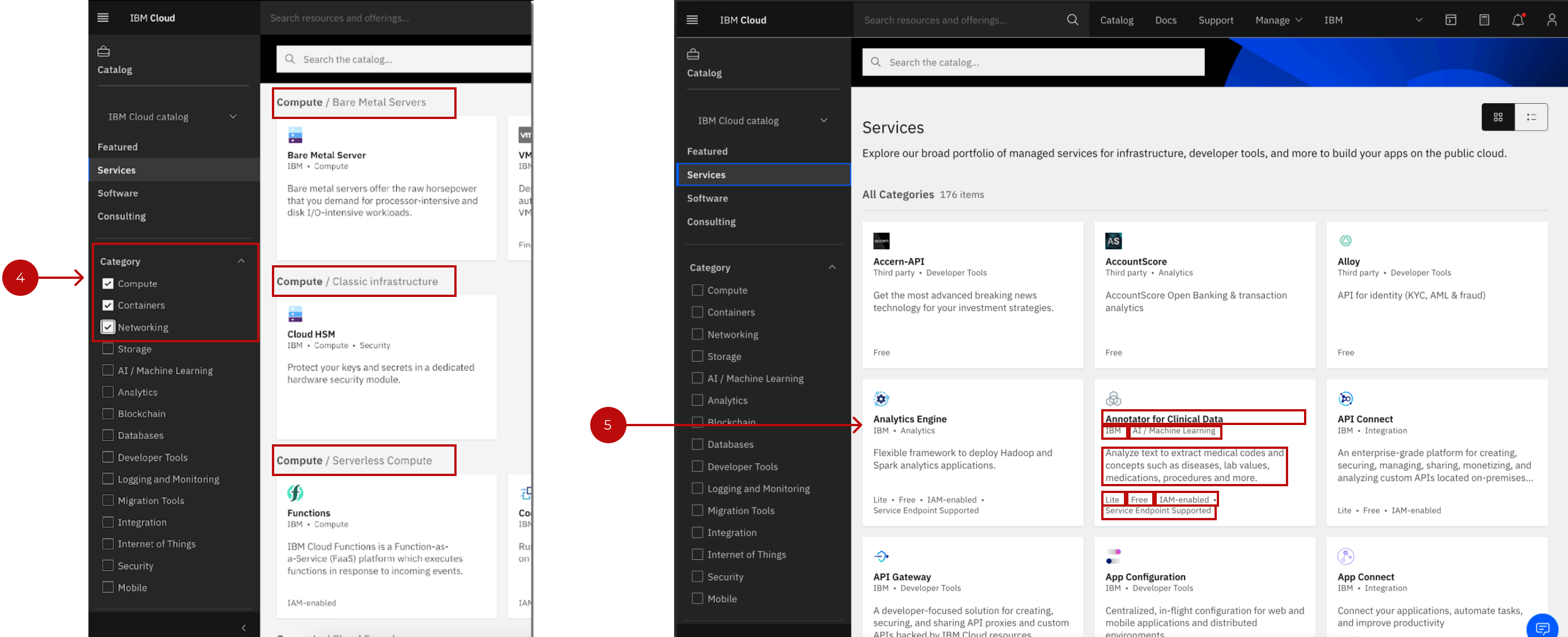
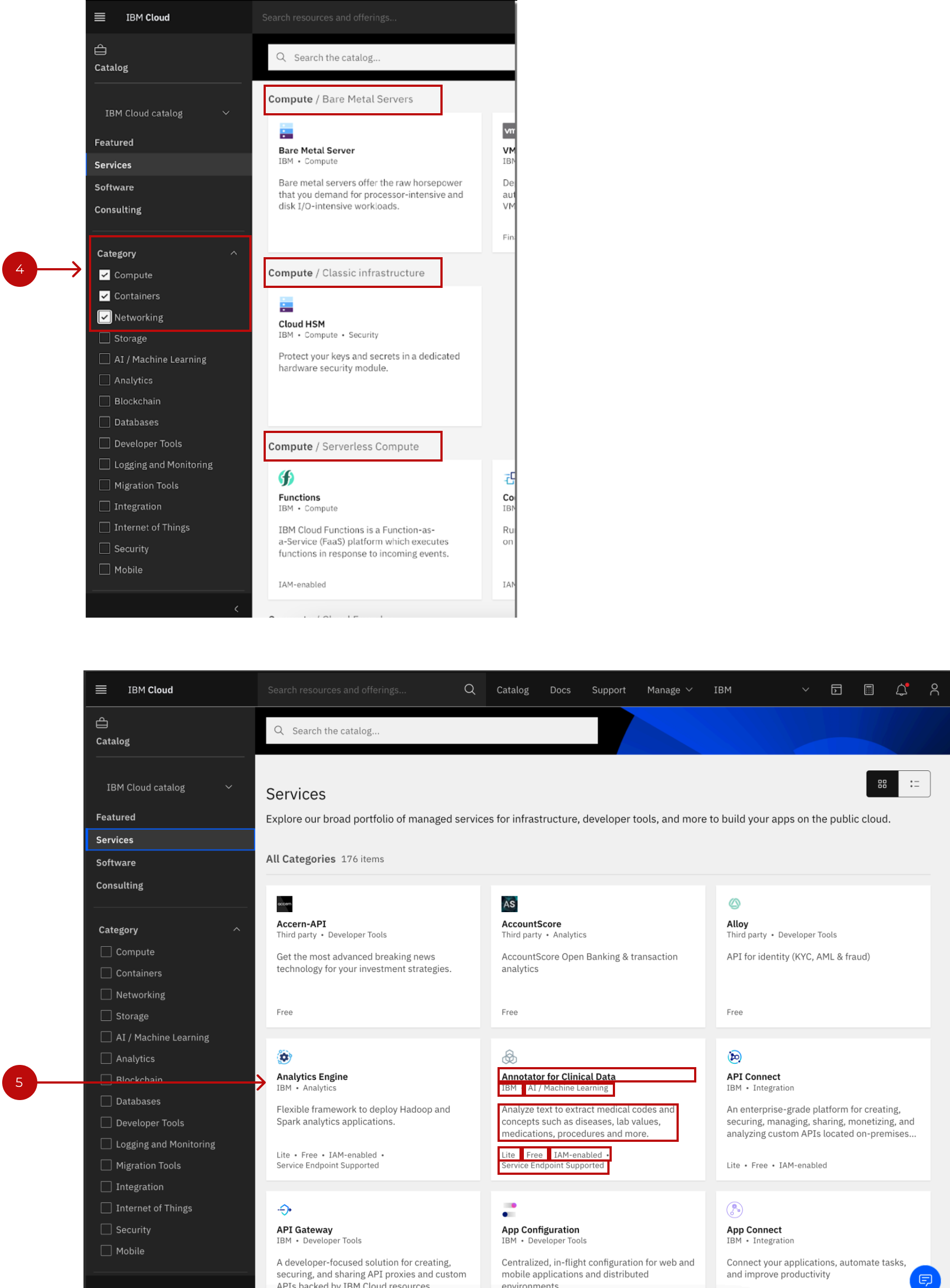
- 4. Our categories were multi-select - which caused redundant categorization in the results & diverged from common marketplace patterns.
- 5. Product tiles were crowded with metadata.
02
What we delivered
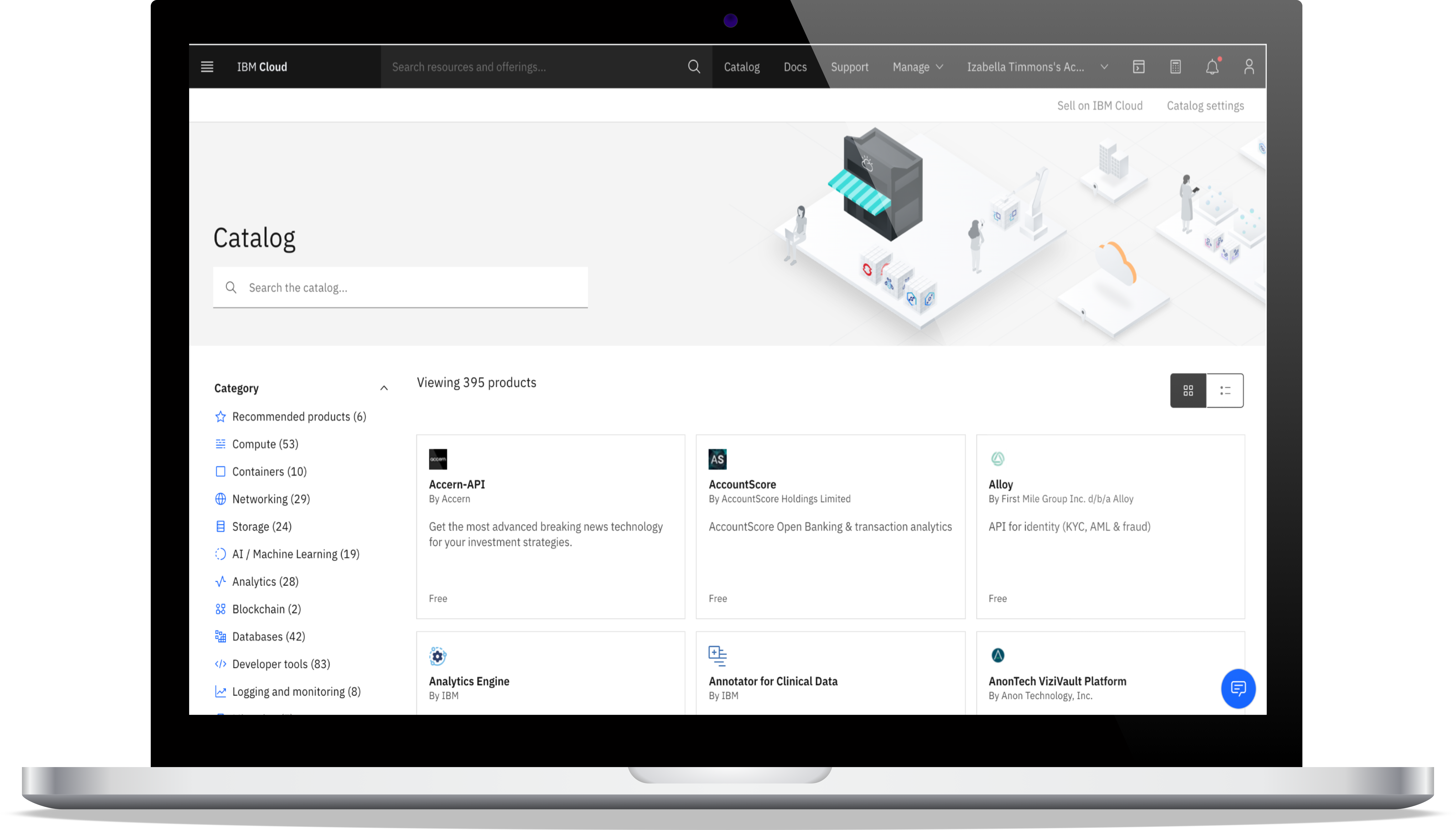
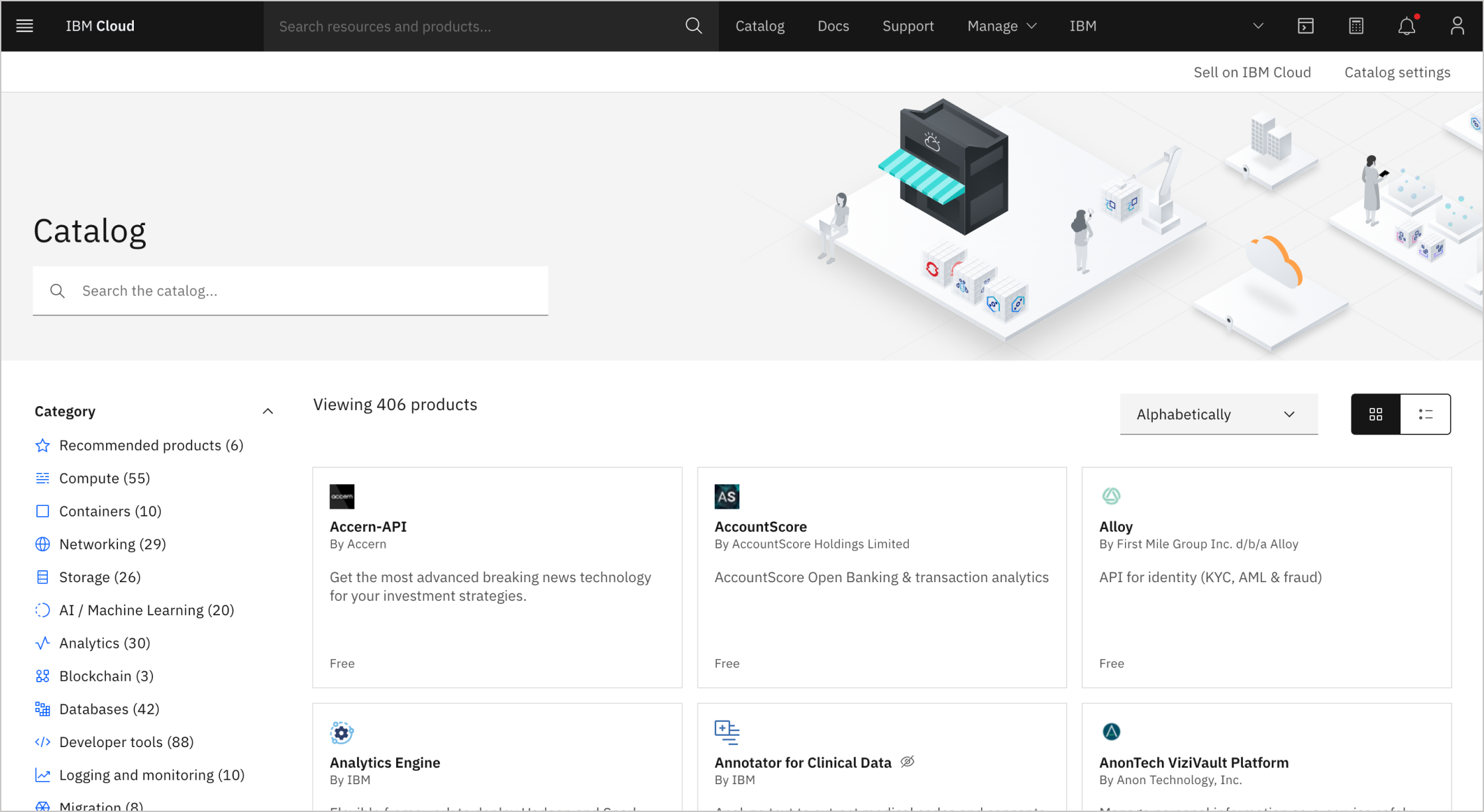
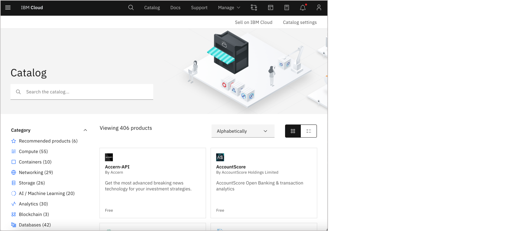
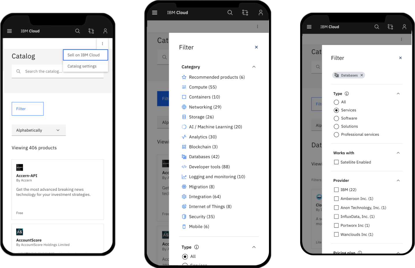
Final mockup
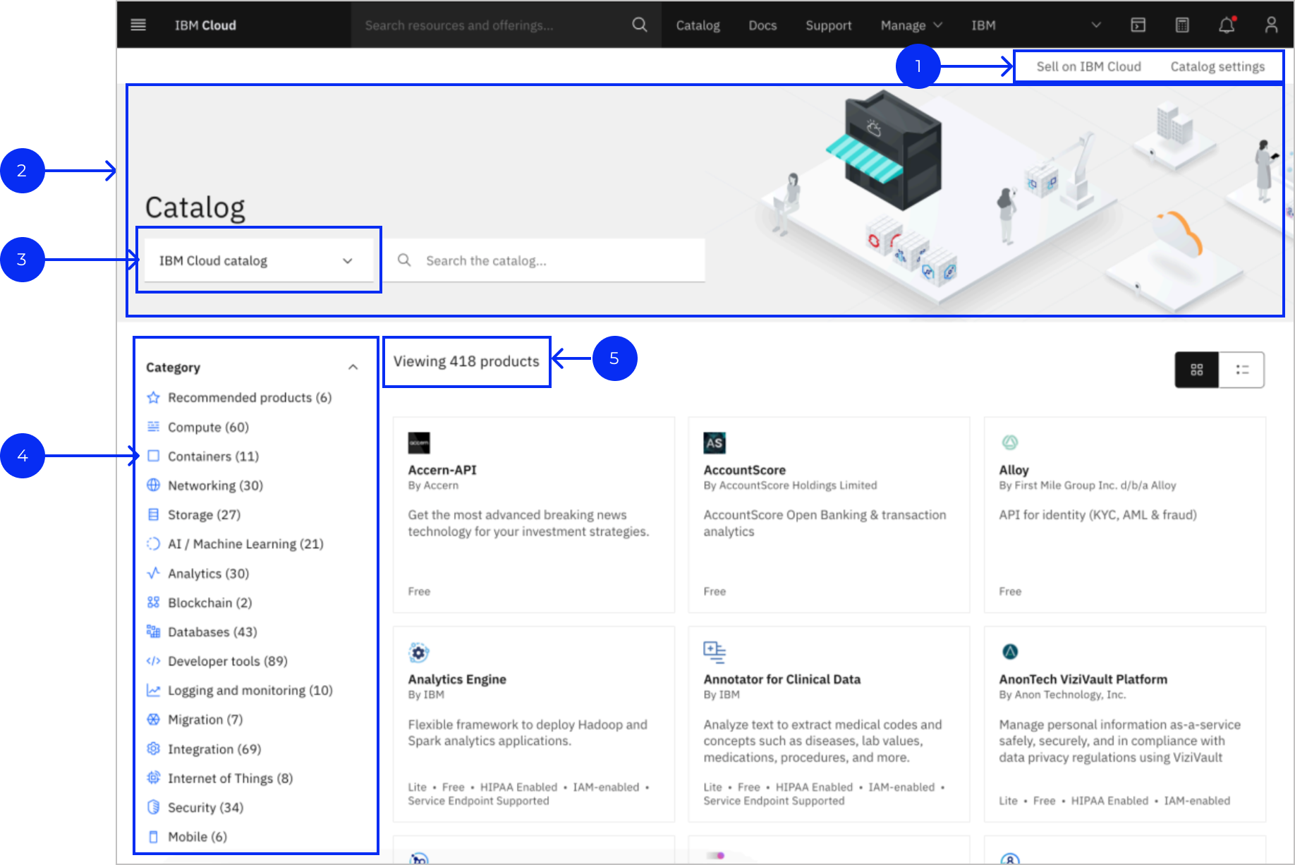

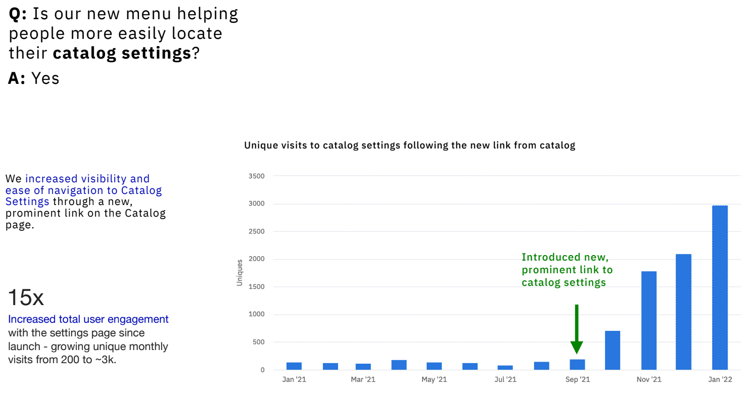
- 1. New, subtle navigation linking to Partner Center and Catalog Settings improves discoverability.
- 2. Expanded header spans the full page width.
- 3. The catalog switcher is now in-line with the search bar to improve discoverability.
- 4. Filters now scroll w/ the page and no more dark background behind the filters.
- 5. All products are visible by default now.





03
Conclusion
Impact
Reduced time to discover and deploy products from IBM Cloud Catalog
