Problem
Even with so many competitors in the cloud storage market, I was tasked with designing a cloud storage web application. My challenge was to understand the users and create functionalities that they wanted and still have a competitive product.
Solution
Through surveys, competitive analysis, and user testing, uconnect was created. I found that users would like to have features as create, save and share content securely and free-up space on their mobile devices and computers.
Design roles
- UX Design
- Visual Design
- Brand & Identity
Design deliverables
- User Surveys
- Personas
- Competitive Analysis
- Concept & Identity
- User Stories & Flows
- Paper Prototype
- Wireframes
- User Testing
- Visual Design
Tools & Software
- Sketch
- Figma
- Invision
- Usability Hub
- Draw.io
01
Research & Discovery
User research
17 people between 26 and 55 years answered the survey.
View survey here.
of users use cloud storage every day
of users use for personal storage
of users said the most important feature is storage space
of users store photos and files as documents, pdf
of users said that their main concern is security
Competitive analysis
The competitive analysis was created to help me understand competitors' strengths and weaknesses as well as their positioning and market focus.
View competitive analysis here.


Google users.
“Users get a complete service.”

Business and personal account.
“Cloud storage and file sharing that works in all devices.”

Businesses and IT users.
“Premium provider of enterprise content collaboration services.”
User Personas
Based on the survey results I created two personas and analyzed their goals, frustrations, and needs, then I could understand the target audience.
View personas here.

Susan B
38 | Editor
Hilliard, OH
“I like to organize photos and files by date and events.”
aaaaaaaaaaaaaaaaaaaaaaaaaaaaaaaaaaaaaaaaaaaaaaaa
Frustation
- Internet dependency
- Pay for more storage space
- Security
Goals
- Store and organize photos
- Organize documents and keep them online
- Edit my documents and presentations online

Joseph P
40 | IT Manager
Columbus, OH
“Have an online space where I can organize my documents without losing them is very important.”
Frustation
- Security
- Internet dependency
- Limited free storage
Goals
- Organize documents
- Decrease paper storage
- Find documents quickly
02
Information Architecture
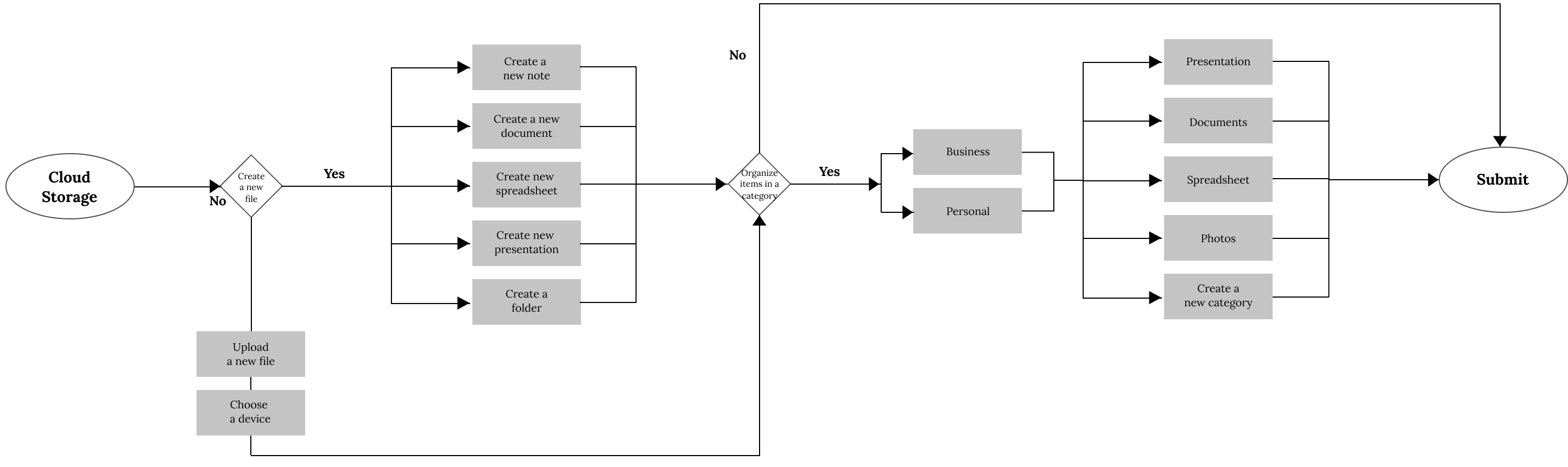
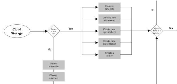
User Stories and Flows
With a better understanding of potential users and the other competitors, I created user stories to help me prioritize product features with minimum viable product-MVP functionalities.
The user stories were then converted in user flows to describe and visualize how the user would interact with the product to accomplish those stories.
View more user stories and user flows here.
Low fidelity mockups
Using user stories and user flows, I began sketching with paper low-fidelity wireframes to define important elements and structure of the website to determine page content and design layout.
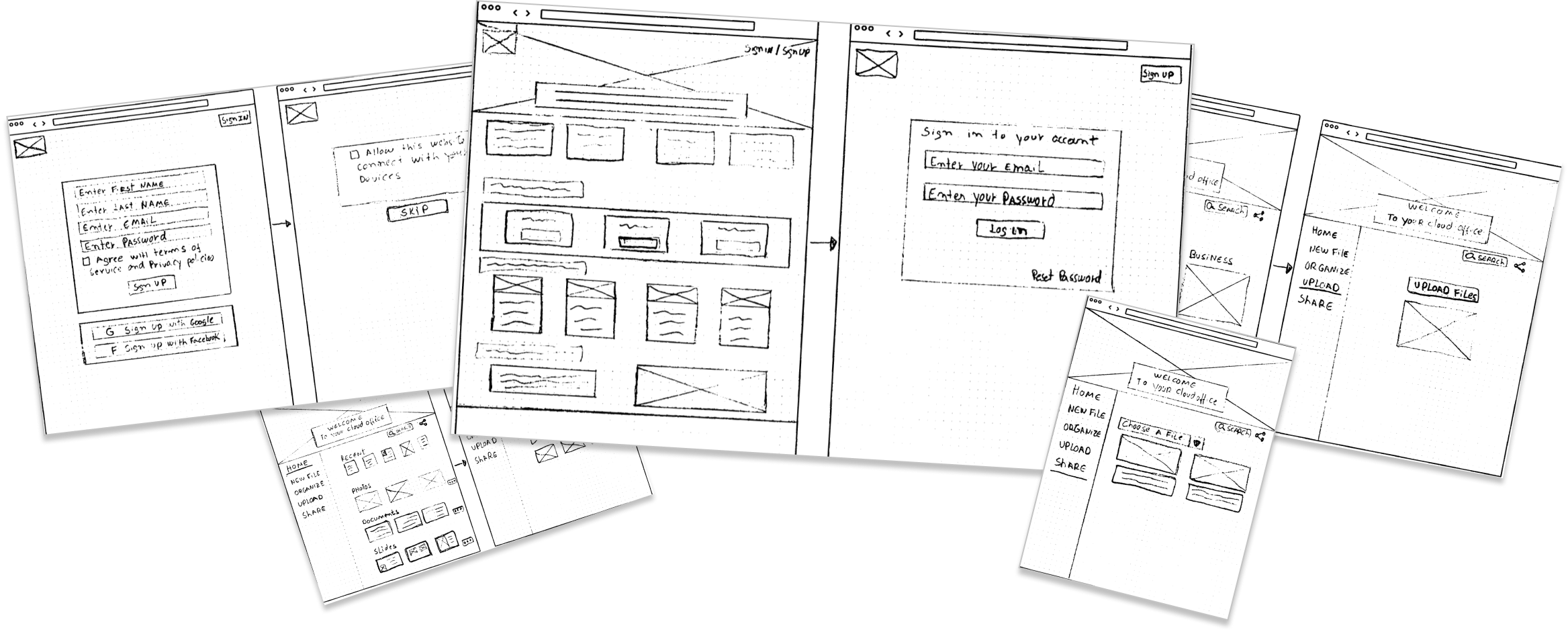
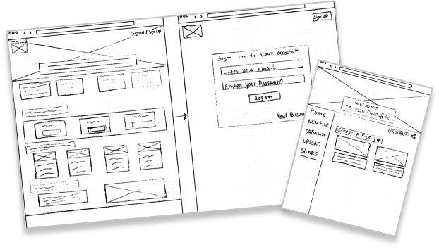
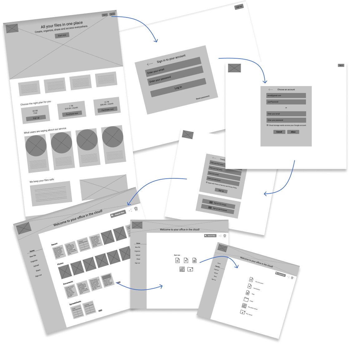
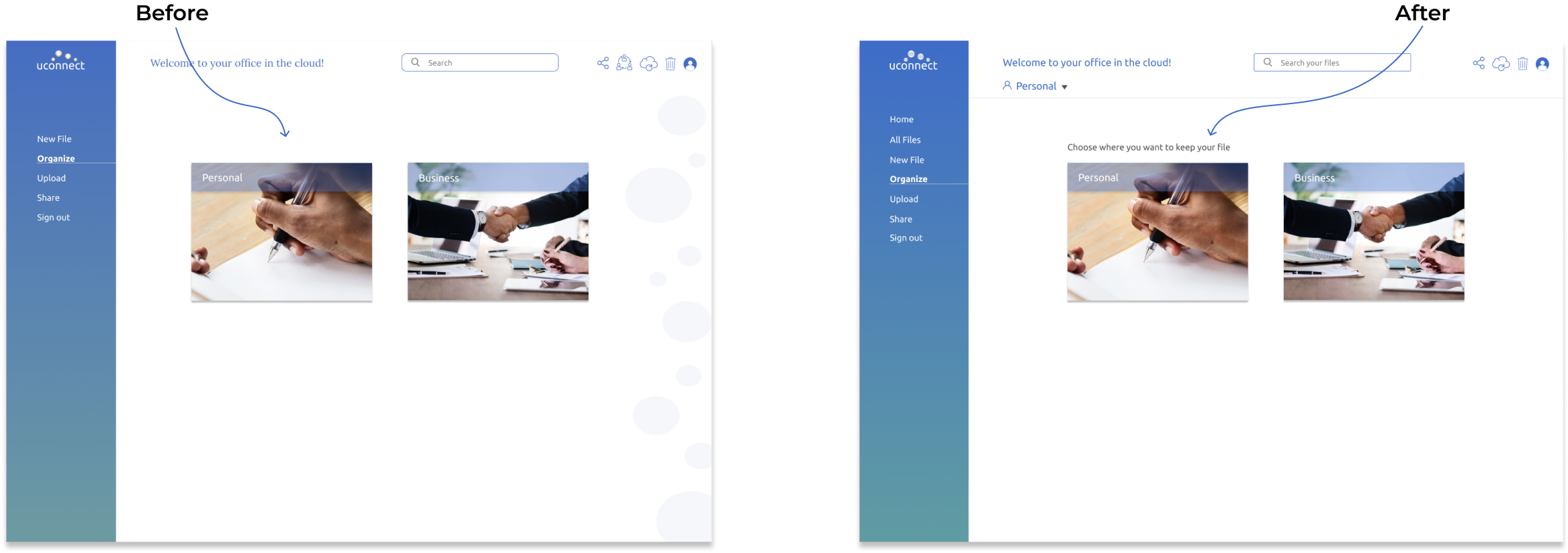
Wireframes and user testing
After creating the low fidelity wireframes I was able to have a foundation of how users would move through uconnect, so it was time to develop wireframes and get ready for testing.
The wireframes were created, tested and experienced many different iterations before becoming high-fidelity prototypes. The first round of testing was conducted on UsabilityHub and also in person. Users were asked to complete a specific set of tasks.
Overall, all the users had a positive response to performing the tasks and were able to navigate the site smoothly.Based on this answers I moved to the next steps.
View wireframes here.
03
Brand Identity
Branding
My goal here was to create a brand that would give users the idea of always being connected to the cloud in a simple and easy way.
The brand needed to capture something secure, simple and fun. It needed to make users feel like they are in an online office where they can create, keep and share files.
View style guide here.
Typography
Ubuntu was chosen to be used on the logo. It has a contemporary style and contains characteristics unique to the brand that convey a precise, reliable and free attitude.
Lora typeface was used in combination with ubuntu along the website
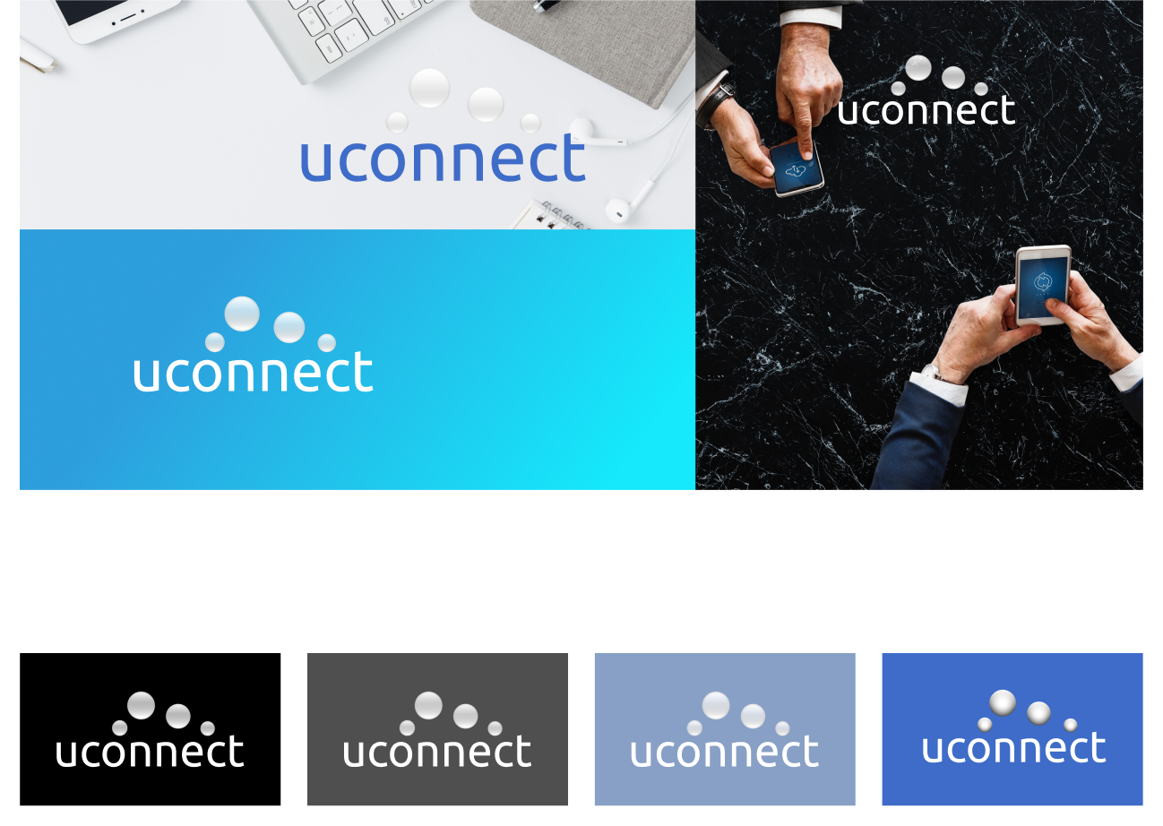
Colors

Logo
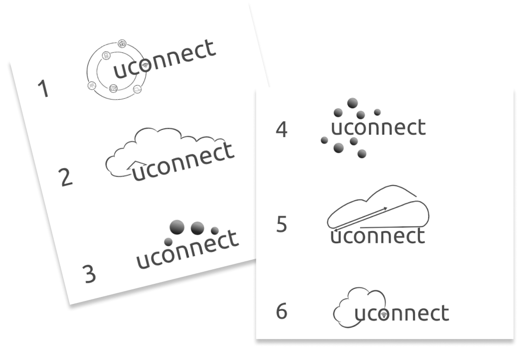
I started out with rough sketches on paper, and I wanted to create a logo that users would think about technology. Searching through fonts that had a tech feel I settled on Ubuntu for uconnect and at the end, I got six different logos of which the number three was chosen after submitting for preference tests.
04
Visual Design & Testing
High fidelity mockups and user testing
The next round of testing was also conducted on UsabilityHub and in person. Most of the testers found it fairly easy to navigate and to do the tasks and only one tester had a hard time figuring out how to organize a file.
After these results, a line of text was included to better guide the user and improve usability.
After receiving feedback from users that I presented my project and also results of preference tests that I collected via Usabilityhub, I had the opportunity to make changes and refine my prototypes.
A / B Preference test
I conducted a preference test on usability hub to see whether one design favored the other. In this test, I wanted to find out which design would be better to use. After getting the results, 60% of the testers choose B. Their main reason was that it looks cleaner and the circles didn’t bring anything to the design.
See more preference test here.


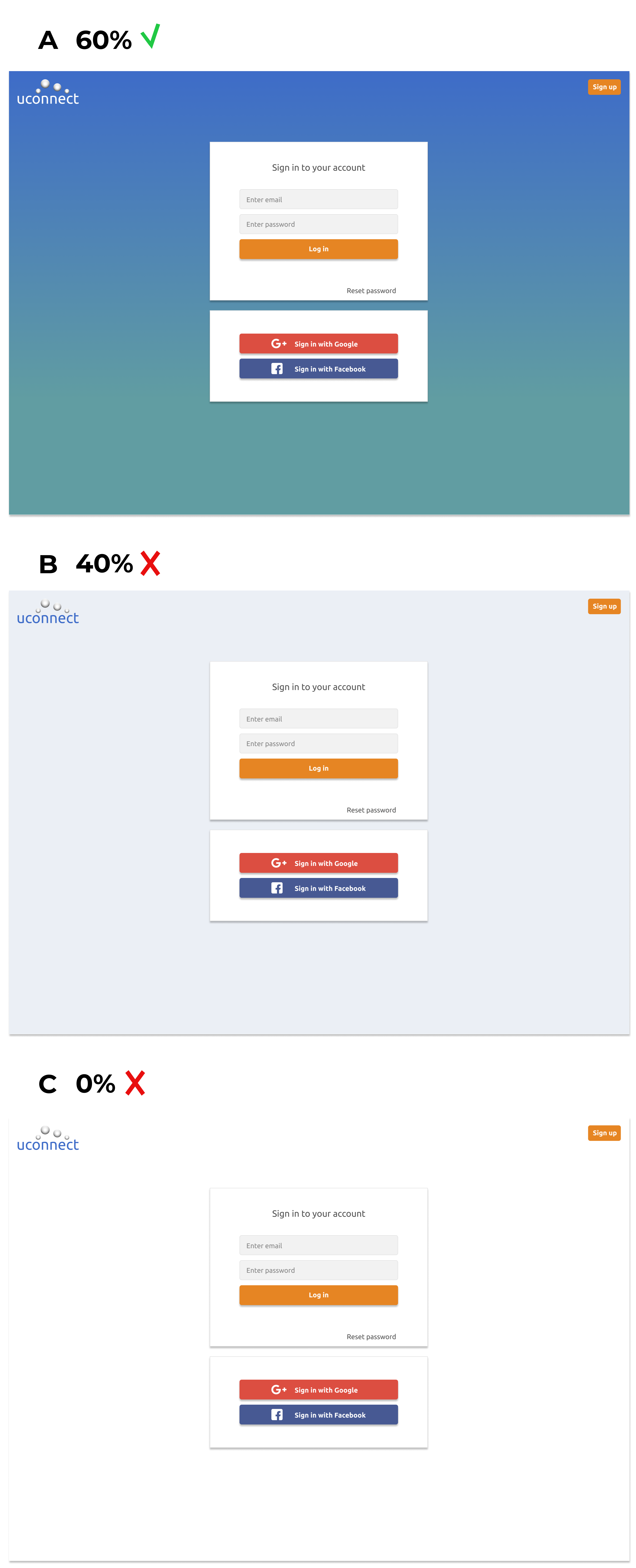
In this test, I wanted to find out what would be the best background color to use. The results showed that 60% of the testers choose A.
A preference test was also performed with the logo and 63% of the participants choose logo A.
After several tests, feedbacks and refinements, this became the final logo.
05
Conclusion
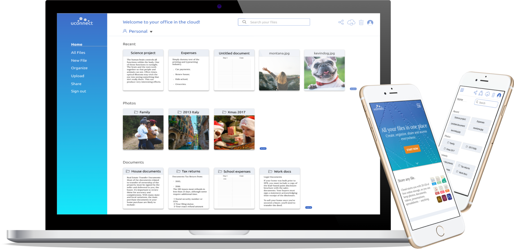
Final Mockup

What I learned
In this project, I had the opportunity to learn how to solve a problem using user research, prototyping, wireframing, usability testing, and preference testing. The data collected from my research and testing helped me plan the site structure and understand patterns to follow. Preference testing and usability testing helped me find functionality gaps in my project and guided me to make decisions based on research results and user needs.
Uconnect was an exciting project to work on, and if given more time, I would develop more functionality to meet beyond the minimum viable product.